Principles of Good Design: Simplicity, Consistency, Accessibility
- By -Lepage Kathy
- Posted on
- Posted in Product Design
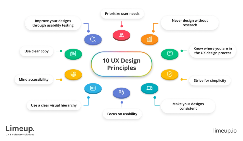
Good design is essential in creating products, websites, and services that are not only aesthetically pleasing but also functional and user-friendly. Adhering to the principles of good design ensures that the end user has a positive experience, leading to higher satisfaction and engagement. In this article, we will delve into some fundamental principles of good design, including simplicity, consistency, and accessibility, and explore how they contribute to effective design solutions.
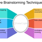
1. Simplicity
Simplicity is about creating designs that are straightforward and easy to understand. This principle emphasizes the importance of stripping away unnecessary elements and focusing on what truly matters. Here are key aspects of simplicity in design:
- Clarity: Ensure that your design communicates its purpose clearly and unambiguously. Users should be able to understand and navigate your design without confusion.
- Minimalism: Avoid clutter by using a minimalistic approach. Include only the essential elements needed to convey the message or function.
- Intuitive Navigation: Design intuitive navigation systems that make it easy for users to find what they are looking for quickly.
Examples:
- Google’s homepage: Known for its clean and simple design, Google’s homepage is devoid of unnecessary elements, focusing on the search functionality.
- Apple products: Apple’s design philosophy revolves around simplicity, with clean lines, minimalistic interfaces, and intuitive user experiences.
2. Consistency
Consistency in design ensures that elements are uniform and predictable, providing a cohesive and harmonious user experience. It involves maintaining uniformity in visual elements, interactions, and overall design language across all platforms and touchpoints.
- Visual Consistency: Use a consistent color palette, typography, and layout across all pages and screens. This helps in creating a recognizable and professional look.
- Functional Consistency: Ensure that interactive elements such as buttons, icons, and navigation behave similarly across the application or website.
- Content Consistency: Maintain a consistent tone, style, and terminology in all written content.
Examples:
- Facebook: Facebook maintains consistency in its design language, ensuring that users have a seamless experience across its desktop and mobile applications.
- Microsoft Office Suite: The Office Suite employs consistent icons, menus, and interfaces across its various applications, making it easier for users to switch between them.
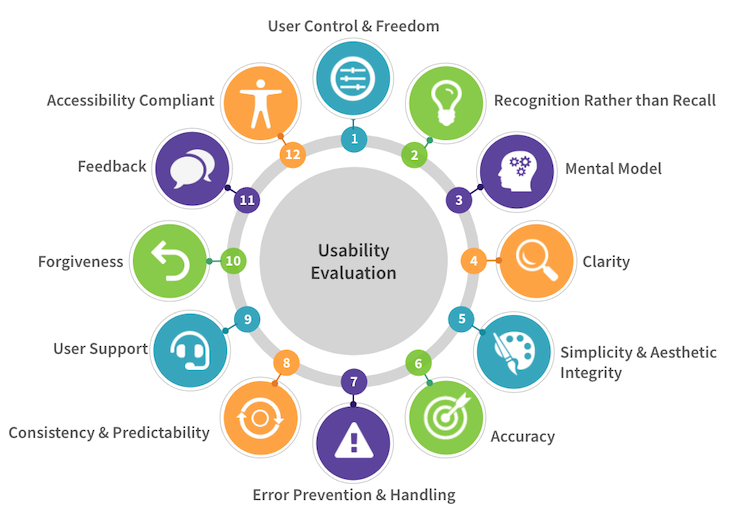
3. Accessibility
Accessibility ensures that your design is usable by people of all abilities and disabilities. This principle involves creating products and interfaces that can be accessed and understood by as many people as possible, including those with visual, auditory, motor, or cognitive impairments.
- Color Contrast: Use high contrast between text and background to make content readable for people with visual impairments.
- Keyboard Navigation: Ensure that all interactive elements can be navigated and operated using a keyboard.
- Alt Text for Images: Provide alternative text descriptions for images to assist screen readers in conveying the content to visually impaired users.
Examples:
- Web Content Accessibility Guidelines (WCAG): Following WCAG ensures that web content is accessible to people with a wide range of disabilities.
- Airbnb: Airbnb’s website incorporates accessibility features such as screen reader support, keyboard navigation, and sufficient color contrast.
4. Hierarchy
Hierarchy in design helps guide users’ attention to the most important elements first. This principle involves organizing content in a way that leads the user through a sequence, making the most critical information stand out.
- Visual Weight: Use size, color, and spacing to create a visual hierarchy. Larger, bolder elements draw more attention than smaller, lighter ones.
- Layout: Arrange elements in a logical and intuitive order, using grids and alignment to create a clear flow.
- Typography: Utilize different font sizes, weights, and styles to differentiate headings, subheadings, and body text.
Examples:
- Newspaper Layouts: Newspapers use hierarchy to guide readers through articles, with headlines, subheadings, and body text organized for easy reading.
- Websites: Many websites use hierarchy to lead users from the most important content, such as a hero image and headline, to supporting information.
5. Balance and Alignment
Balance and alignment involve arranging elements in a way that creates a sense of equilibrium and harmony. Proper balance and alignment make designs look organized and aesthetically pleasing.
- Symmetrical Balance: Distribute elements evenly on both sides of a central axis.
- Asymmetrical Balance: Use different elements of varying sizes and weights to create a balanced composition without symmetry.
- Alignment: Align elements to create visual connections and improve readability. Consistent alignment makes a design look clean and organized.
Examples:
- Print Media: Magazines and brochures use balance and alignment to create visually appealing layouts.
- Web Design: Websites use grid systems to align content consistently and create balanced page layouts.
6. Contrast
Contrast is the difference between two or more elements in a design, such as color, size, shape, or texture. It is used to create visual interest and draw attention to specific areas.
- Color Contrast: Use contrasting colors to make elements stand out and improve readability.
- Size Contrast: Vary the size of elements to create a visual hierarchy and emphasize important content.
- Shape Contrast: Use different shapes to differentiate elements and add visual interest.
Examples:
- Posters and Advertisements: Posters often use contrast in color and size to capture attention and convey key messages.
- Web Design: Websites use contrast to highlight calls to action and important information.
Conclusion
Understanding and applying the principles of good design—simplicity, consistency, accessibility, hierarchy, balance and alignment, and contrast—can significantly enhance the user experience and effectiveness of your products, websites, and services. These principles ensure that your design is not only visually appealing but also functional, user-friendly, and inclusive. By adhering to these guidelines, you can create designs that resonate with your audience and achieve your desired outcomes.