Common Design Mistakes and How to Avoid Them
Design is a creative process that requires attention to detail, understanding of user needs, and adherence to best practices. However, designers often encounter common pitfalls that can impact the effectiveness and aesthetic appeal of their work. By identifying these mistakes and implementing preventive measures, designers can enhance their designs and deliver better outcomes. Here are some of the most common design mistakes and strategies to avoid them:

1. Poor Typography Choices
Mistake: Choosing inappropriate fonts, inconsistent typography, or using fonts that are difficult to read can undermine the readability and visual appeal of your design.
Preventive Measures:
- Choose Readable Fonts: Select fonts that are legible and appropriate for the context of your design. Consider factors like font size, line spacing (leading), and letter spacing (tracking).
- Establish Hierarchy: Use different font sizes, weights, and styles to create a clear hierarchy of information. Headlines should be distinct from body text, and emphasis should be placed on important elements.
- Maintain Consistency: Establish consistent typography throughout your design to maintain coherence and readability.
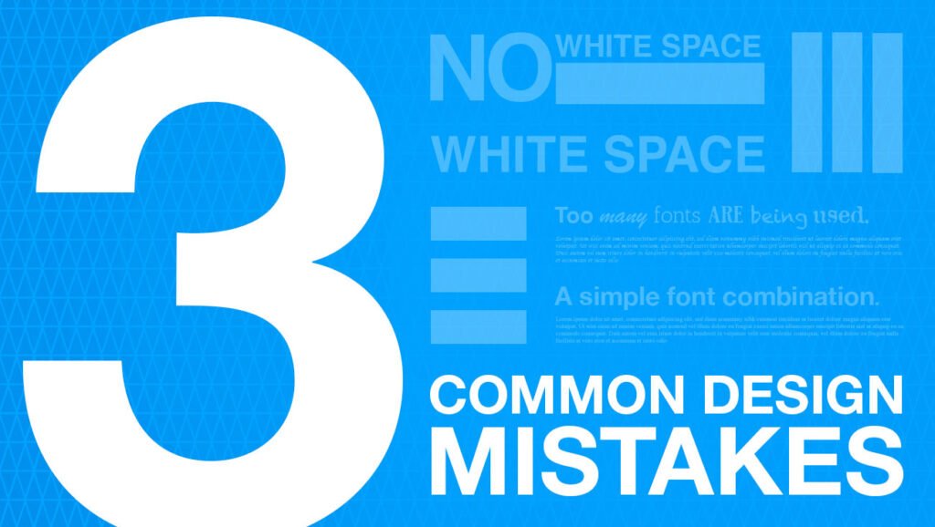
2. Lack of White Space
Mistake: Overcrowding your design with elements and neglecting white space (negative space) can lead to a cluttered and confusing layout.
Preventive Measures:
- Embrace White Space: Allow adequate space between elements to create visual breathing room. White space improves readability, enhances visual appeal, and guides the viewer’s eye.
- Balance Elements: Achieve a harmonious balance between content and white space to avoid overwhelming the viewer. Experiment with spacing to find the right balance for your design.
3. Ignoring Visual Hierarchy
Mistake: Failing to establish a clear visual hierarchy can result in a design where important elements are not emphasized, making it difficult for users to navigate and comprehend.
Preventive Measures:
- Use Size and Scale: Larger elements naturally draw more attention. Use size variations to indicate the importance of different elements within your design.
- Color and Contrast: Utilize color contrast to highlight key elements. Bold colors or high-contrast combinations can direct attention and create visual interest.
- Spacing and Alignment: Consistent spacing and alignment help organize content and guide the viewer’s eye through the design hierarchy.
4. Poor Color Choices
Mistake: Selecting inappropriate color palettes, using too many colors, or neglecting color psychology can affect the mood, readability, and overall effectiveness of your design.
Preventive Measures:
- Understand Color Psychology: Different colors evoke specific emotions and associations. Consider the psychological impact of colors on your audience when choosing a color palette.
- Limit Your Palette: Stick to a cohesive color scheme with a few primary colors and complementary accents. This creates visual harmony and prevents color overload.
- Accessibility: Ensure sufficient color contrast for text and background elements to maintain readability, especially for users with visual impairments.
5. Inconsistent Design Elements
Mistake: Inconsistency in design elements such as styles, colors, or imagery can lead to a disjointed user experience and diminish brand identity.
Preventive Measures:
- Create a Style Guide: Develop a comprehensive style guide that outlines guidelines for typography, colors, imagery, and other design elements. This ensures consistency across all marketing materials.
- Use Templates: Utilize design templates or grids to maintain consistency in layouts and proportions. Templates streamline the design process and reinforce brand standards.
- Regular Review: Conduct regular reviews of design assets to ensure they adhere to established guidelines and maintain consistency over time.
6. Ignoring User Experience (UX) Principles
Mistake: Neglecting user experience principles can result in designs that are difficult to navigate, confusing, or fail to meet user expectations.
Preventive Measures:
- Research and Testing: Conduct user research to understand the needs, behaviors, and preferences of your target audience. Use usability testing to gather feedback and iterate on design improvements.
- Usability Guidelines: Follow established UX principles such as intuitive navigation, clear calls to action, and responsive design. Prioritize user needs and design with usability in mind.
- Accessibility: Ensure your design is accessible to all users, including those with disabilities. Consider factors like color contrast, text readability, and screen reader compatibility.
Conclusion
Avoiding common design mistakes requires a combination of knowledge, attention to detail, and a user-centric approach. By addressing issues such as typography choices, white space management, visual hierarchy, color selection, design consistency, and adherence to UX principles, designers can create more effective and visually appealing designs. These preventive measures not only improve the aesthetics of your work but also enhance usability and user satisfaction, ultimately leading to more successful design outcomes.


